

 Jessica Hische is a letterer and illustrator working in Brooklyn, New York. After graduating from Tyler School of Art in 2006 with a degree in Graphic Design, she worked for Headcase Design in Philadelphia before taking a position as Senior Designer at Louise Fili Ltd. While working for Louise, she continued developing her freelance career, working for clients such as Tiffany & Co., Chronicle Books, and The New York Times. In September of 2009, after two and a half years of little sleep and a lot of hand-lettering, she left Louise Fili to pursue her freelance career further. Jessica has since traveled the world speaking to young designers about lettering, illustration, and how to stay inspired, released two typefaces—Buttermilk and Snowflake—and enrolled in the Cooper Union program in typeface design to further her education and hopefully create some very useful fonts in the very near future.
Jessica’s work has appeared in many major design and illustration publications in America and abroad including Communication Arts, Print, HOW, Graphis, Novum, American Illustration, and The Society of Illustrators Annuals. She has been personally profiled in CYMK Magazine, Step Magazine’s 25 Emerging Artists Issue, Communication Arts “Fresh” Section, Print Magazine’s New Visual Artists Issue 2009 (commonly referred to as Print’s “20 under 30”), Illustration Magazine (Japan), and was named an Art Directors Club “Young Gun” and Lettercult’s Person of the Year 2009.
When not drawing fancy letters, she can be found watching the internet, endulging in fancy bad-for-you meals and whiskey-laden cocktails with her better half, or snuggling with her two kitties. For more information on Jessica, please see her extensive FAQ page and visit her portfolio site which is updated regularly.
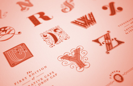 In September of 2009, when I left my (wonderful) day-job and became a full-time freelancer, I gave myself a project. I wanted something to keep me motivated when client work was slow, to keep me inspired when I was working on things that weren’t so inspiring, and to give me something to do on a regular schedule when my life went from being incredibly regimented (day-job), to willy-nilly (freelance)—so began Daily Drop Cap. I originally planned to do an alphabet per week but realized quickly that it was hard enough to keep up with a letter per day. Within days of launching, the site had received an enormous amount of traffic and within months it had been featured on hundreds of design blogs. I didn’t know at the time that my little pet project would be what really catapulted me onto the design scene, that it would be how most clients were originally introduced to my work, and that it would forever brand me with the nickname “that drop cap girl”.
I’m so grateful for everyone that has shown enthusiasm for the project and for people that have sent lovely emails about how it inspired them to do more lettering or start a daily project of their own. I’m especially grateful for all the folks that helped spread the word by posting about the project on their sites or tweeting about the project—I owe my career to you, so if we meet in person, be sure to claim the beer that I undoubtedly owe you in return.
About the website: I decided to move from tumblr to wordpress and give the site a major overhaul. I’ve always wanted to teach myself how to manipulate wordpress and hone my css skills and this was the perfect excuse. II don’t plan on doing web design professionally, but because I make so many zany internet projects it has been imperative that I at least learn how to prettify a blog. The fonts used are Perpetua Titling Light, Perpetua, Bulmer, and Bulmer Italic enabled by Webtype.