Special Guest

K
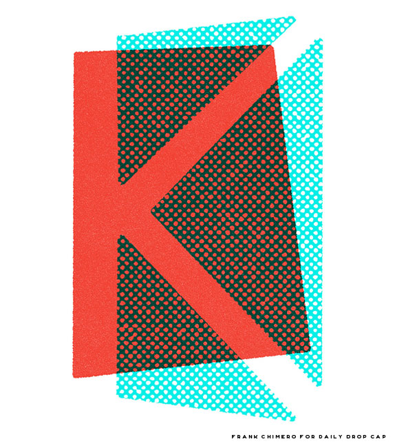
ickstarter (or really, all you fine internet folk) is about to pay Frank Chimero a buttload of money for his upcoming book The Shape of Design, and that is awesome. I’m assuming you are all as jealous as me that he has a legit excuse to take a few months off to write, but thankfully he had time to draw this awesome K before retreating to the woods of Oregon. Aside from being a writer, thinker, educator and general internet person of interest, Frank is also a designistrator with a style rooted in printy textures and Paul Randish plays of shape and color. His K feels like it would be as at home in 1954 as it does in 2011.

F   Copy this code at the beginning of your text (You’ll need to be in the html editing window.):

<img src="http://dailydropcap.com/images/frank-chimero-small.jpg" title="Daily Drop Cap by Frank Chimero" align="left" alt="K"/>

F   Be sure to remove the original text letter you are replacing.

Special Guest

Lovely doesn’t begin to describe the work of Deanne Cheuk, the awesome art director, illustrator and artist that crafted this L. Her list of accolades is super impressive: She got her first job as a magazine art director at the age of 19 immediately out of college and has since art directed or designed numerous publications, including Tokion Magazine. Her client list is ridiculous including the likes of Swatch, Target, and American Express. She has worked with David Carson, Doug Aitken and Conan O’Brien. In 2005, Cheuk released her first book, Mushroom Girls Virus — which sold out worldwide immediately. That same year she was the inaugural designer chosen for the (sadly now defunct) NYTimes On Language section. In 2006, Target launched a line of “Deanne Cheuk” products. So yes, she is awesome and I hope you now have as big of a girl-crush as I do!

F   Copy this code at the beginning of your text (You’ll need to be in the html editing window.):

<img src="http://dailydropcap.com/images/deanne-cheuk-small.jpg" title="Daily Drop Cap by Deanne Cheuk" align="left" alt="L"/>

F   Be sure to remove the original text letter you are replacing.

Special Guest

M
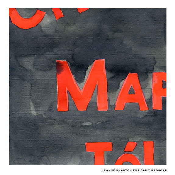
ost of the guest contributors to this alphabet are letterers, illustrators or designers, but Leanne Shapton is all three and more. She was the art director of the New York Times Op-Ed page, she’s an author of several books, she used to contribute a travel column to Elle Magazine, She currently contributes an illustrated series to the NYTimes opinion page website called “A Month Of…”…the list goes on. Leanne was one of the first people I knew I had to ask for this alphabet, and I was absolutely thrilled that she was able to contribute! Her hand-painted and drawn lettering is beautiful in its simplicity. I particularly love her wooden book series, and picked up a few of the titles myself last year. Her drop cap is modeled after the hand-painted store signs in Paris painted directly onto buildings.

F   Copy this code at the beginning of your text (You’ll need to be in the html editing window.):

<img src="http://dailydropcap.com/images/leanne-shapton-small.jpg" title="Daily Drop Cap by Leanne Shapton" align="left" alt="M"/>

F   Be sure to remove the original text letter you are replacing.

Special Guest

No introduction needed for today’s guest contributor Louise Fili Ltd. Louise is a legend and my number one hero in design. If it wasn’t for her, I definitely wouldn’t be where I am today career wise—she was an epically amazing teacher and just general all around great person to work for so of course she was first on my list to ask to contribute to the guest alphabet. If you’re not familiar with Louise’s work, for shame—immediately hop over to her site and buy every book she’s ever been a part of. This beautiful N is definitely among my favorites of the guest alphabet, crafted by Louise and her handy senior-designer-sidekick John Passafiume, who currently holds the position at team LFL that I held not that long ago. I could wax on for days about how awesome Louise is, but you probably know this already, so instead I’ll leave you to gawk at this gorgeous letter.

F   Copy this code at the beginning of your text (You’ll need to be in the html editing window.):

<img src="http://dailydropcap.com/images/louise-fili-small.jpg" title="Daily Drop Cap by Louise Fili" align="left" alt="N"/>

F   Be sure to remove the original text letter you are replacing.

Special Guest

Oh my is Darren Booth a talent! For one, he’s hilarious (you should really follow him on twitter, it’s hard to not RT everything he writes), but he’s also a super talented letterer and illustrator. For his drop cap, he worked in his signature painterly collagey style with awesome results! You have probably seen a bit of his work lately because of his awesome cover for Steve Martin’s book (which was shown on Letterman! Soooo Jealous!), but I’ve been a fan of his for a while, particularly his lovely color palette.

F   Copy this code at the beginning of your text (You’ll need to be in the html editing window.):

<img src="http://dailydropcap.com/images/darren-booth-small.jpg" title="Daily Drop Cap by Darren Booth" align="left" alt="O"/>

F   Be sure to remove the original text letter you are replacing.

Special Guest

Part and Parcel is Damien Correll’s collaborative effort with designistrator pal Garrett Morin, and they make some insanely imaginative playful work. Damien doesn’t disappoint with today’s drop cap, which would put a smile on anyone’s face from preschool and up. When I first moved to New York, I was made aware of an awesome dude collective that had formed by Damien, Garrett and Ryan Waller called Rad Mountain (now defunct). It took a while before our paths overlapped—first when Garrett won Print’s 20 under 30 the same year as me, and then when Damien won ADC Young Guns we finally met in person! (Can you see how small of a city/scene New York is??) Anyhoo—Damien, while no longer part of a mountain, is still quite rad.

F   Copy this code at the beginning of your text (You’ll need to be in the html editing window.):

<img src="http://dailydropcap.com/images/damien-correll-small.png" title="Daily Drop Cap by Damien Correll" align="left" alt="P"/>

F   Be sure to remove the original text letter you are replacing.

Special Guest

Quit what you’re doing right now and check out Josh Cochran’s site, the amazing illustrator (and my dear friend / brotherfromanothermother) that qrafted today’s drop qap. You may have seen his ridiculously hilarious and awesome zombies vs. unicorns illustration, which I would go on record to say is one of my favorite drawings of all time. Josh is a part of my studiofriendposse at The Pencil Factory in Brooklyn (the actual former Eberhard Faber factory, not the bar across the street or the fancy lofts that were built last year) which is populated with some massive talent in the illustration industry. I’m so happy Josh was able to participate and churned out this awesome Q! Putting a bird on it really DOES always work!

F   Copy this code at the beginning of your text (You’ll need to be in the html editing window.):

<img src="http://dailydropcap.com/images/josh-cochran-small.jpg" title="Daily Drop Cap by Josh Cochran" align="left" alt="Q"/>

F   Be sure to remove the original text letter you are replacing.

Special Guest

Really, when do these guys sleep?? From their site: “Originally conceived in 2001 as an avant-garde anti-design movement by Nolen Strals and Bruce Willen, Post Typography specializes in graphic design, conceptual typography, and custom lettering/illustration with additional forays into art, apparel, music, curatorial work, design theory, and vandalism.” I have been a huge fan of Bruce and Nolen’s work for some time now and was over the moon when they agreed to do a drop cap. We cross paths (sort of) earlier this year when both of our work was selected for the Lubalin Now show at Cooper Union. I love what they did with their R!

F   Copy this code at the beginning of your text (You’ll need to be in the html editing window.):

<img src="http://dailydropcap.com/images/posttypography-small.jpg" title="Daily Drop Cap by Post Typography" align="left" alt="R"/>

F   Be sure to remove the original text letter you are replacing.

Special Guest

S
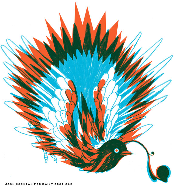
ome people are just so talented that they make you burn with envy. Alex Trochut is one of those people for me, his work is just amazing. The S that he contributed for Daily Drop Cap is just one of the styles he’s been experimenting with lately, but he works within so many styles from hyper-illustrative (RIDICULOUSLY BADASS) lettering to more classically influenced ornamental type. If you have been paying attention to illustrative lettering at all in the last five years, you should know Alex’s name by heart. His work has been all over the internet, in all kinds of annuals and magazines, and in gallery shows around the world. I was SO EXCITED when he was able to contribute, as I am a culty superfan of his stuff.

F   Copy this code at the beginning of your text (You’ll need to be in the html editing window.):

<img src="http://dailydropcap.com/images/alex-trochut-small.jpg" title="Daily Drop Cap by Alex Trochut" align="left" alt="S"/>

F   Be sure to remove the original text letter you are replacing.

Special Guest

To say Jon Contino is a talented guy would be a massive understatement. Hailing from the great city of BKLYN, Jon has really mastered masculine but refined hand-done lettering. His sailor-tattoo-ish scripts are super lovely and all of his work makes me want to drink a beer and get in a fist fight. On top of his own lettering projects, he’s also co-founder and creative director of design studio Onetwentysix and menswear brand CXXVI Clothing Company. Aside from being an obviously busy dude, he’s also a very nice and humble guy. Thanks for contributing, Jon!

F   Copy this code at the beginning of your text (You’ll need to be in the html editing window.):

<img src="http://dailydropcap.com/images/jon-contino-small.jpg" title="Daily Drop Cap by Jon Contino" align="left" alt="T"/>

F   Be sure to remove the original text letter you are replacing.